


We develop solutions based on smart-contracts for game-developers to explore new ways to grow and enhance their product value.
www.nebulla.io


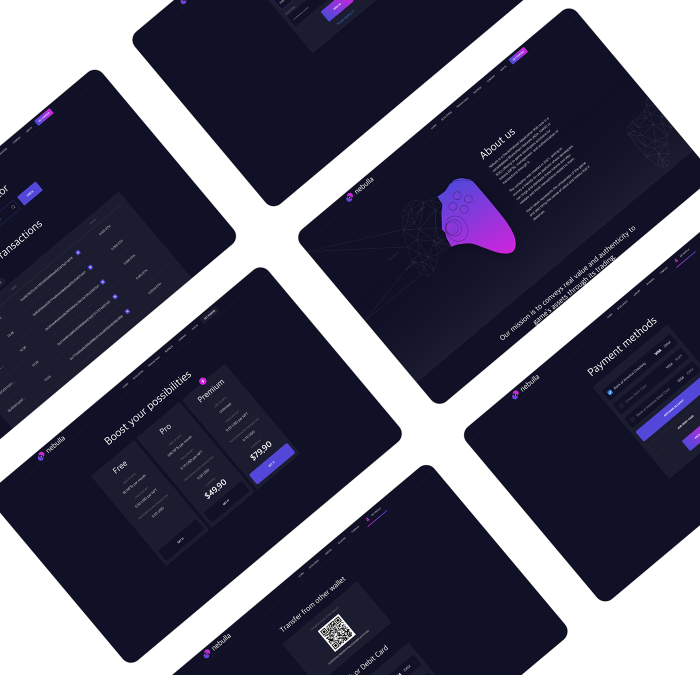
Design Inspiration and Consistency
I decided to use a character holding a purple diamond to represent the game industry and its value and also as my entry point to grab the audience's attention initially and then guide their eyes through the composition until finally taking the action.
I also was very careful with the texts, using a range of 20 to 40 letters per line and 3 lines per paragraph which makes the reading process smooth and straightforward. It also helps to avoid widows, rivers, and some annoying inconsistencies in the text.

I was not concerned about showing all the content in the first page because I just wanted to grab the interest and curiosity of our audience. The rest of the content can be found on the subpages.

Visual Identity
The idea was to keep it as simple as possible, using a darker tone as the main color and to represent the negative space and also working with vibrant colors to create contrast between the elements in the composition and define hierarchy.

Hierarchy
Being simple does not mean being poor in style. I played specially with different sizes of font to create the hierarchy and convey the message with efficiency. Keeping in mind that to create consistency we have to create visual rules, I created a standard for each class of text. Ex: titles are bigger than subtitles, classes of text have fixed size and so on.
I also used some icons and images to enhance and complement that message. There's a motion graphic that can be seen on the website.
Prototype Testing


